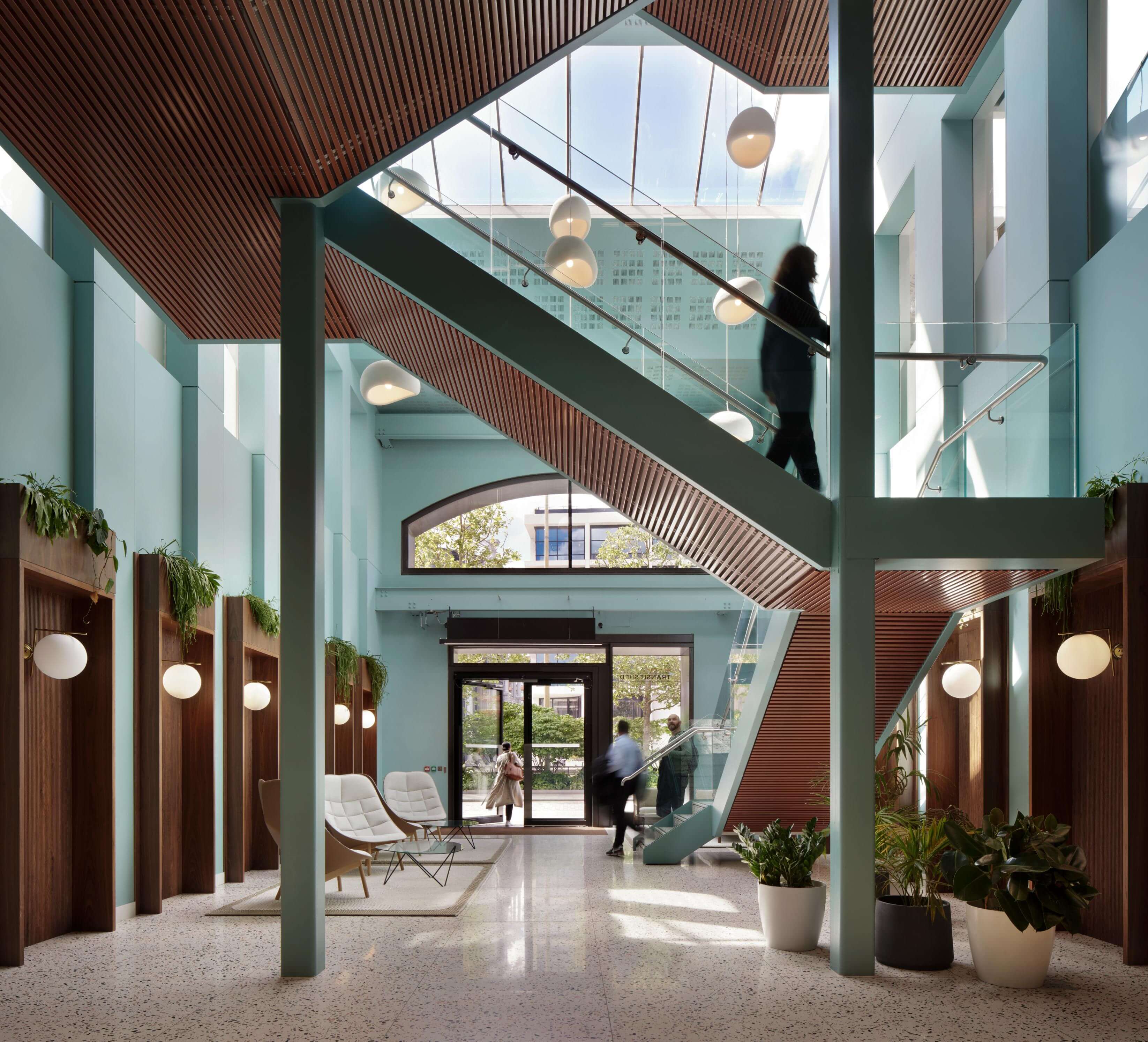
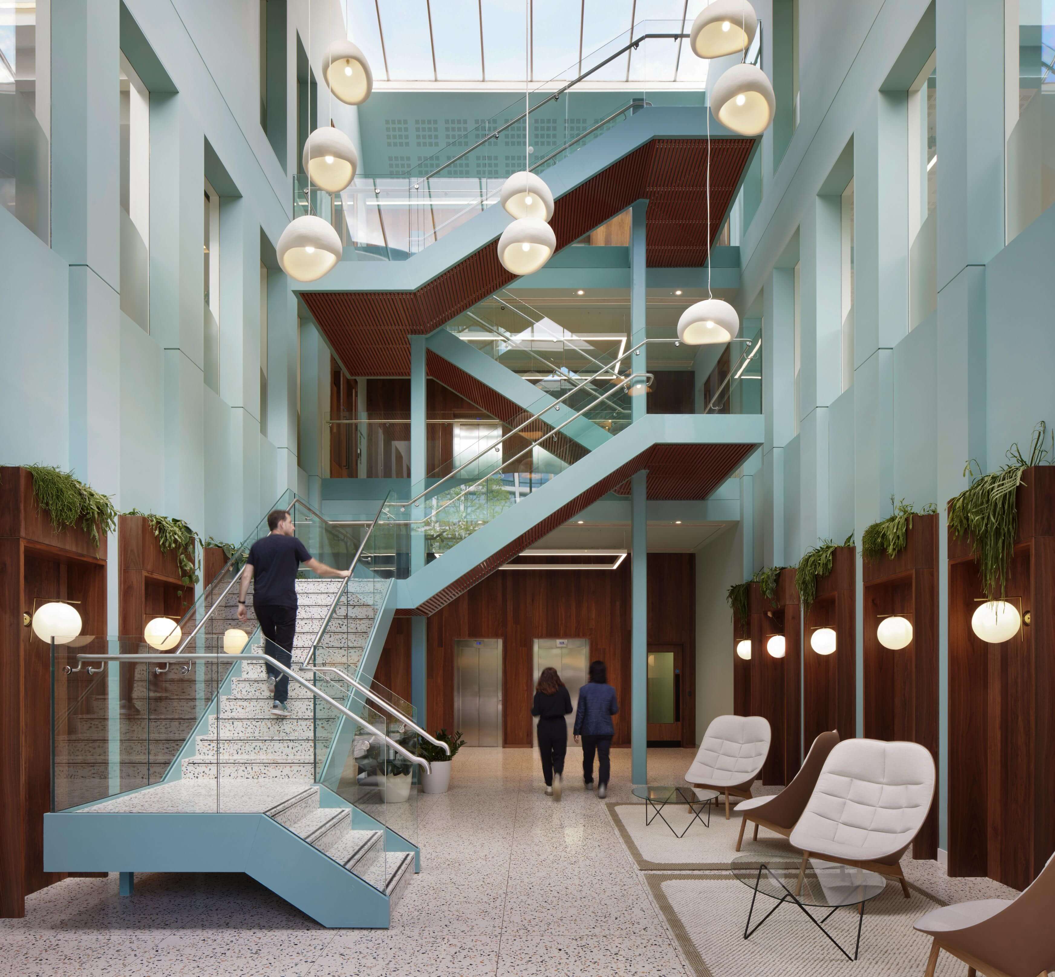
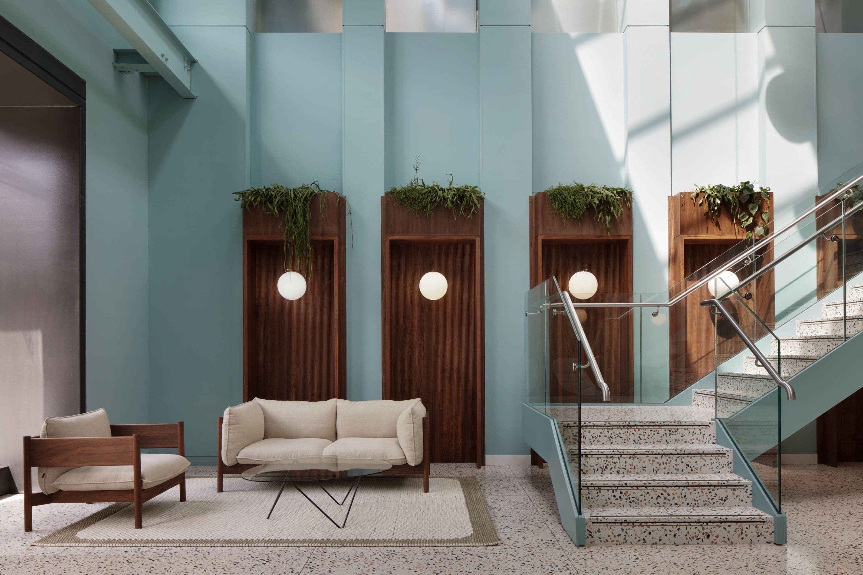
12–13 Stable Street sits within the Granary Square regeneration area, surrounded by public space, cafés and workplaces. Inside, the building now feels open, calm and welcoming. Timber, terrazzo and soft blue tones introduce warmth without overpowering the architecture. Informal seating invites people to pause, meet and work, while subtle reconfigurations make the plan clearer to read. The result is a reception and circulation sequence that feels comfortable, generous and appropriate to its King’s Cross setting.
- Location
- King's Cross, London
- Size
- 18,800 sqft
- Client
- Argent
The 18,800 sqft building had strong fundamentals, but its interiors felt dated and underwhelming, particularly upon arrival. Argent asked for a refresh that was economical and precise. The ambition was to elevate first impressions, improve the everyday experience for tenants and visitors, and bring the space in line with its central location, while avoiding unnecessary waste.
Rather than redesigning everything, we set out to identify where small, targeted moves could create the greatest impact. We wanted to improve visibility, soften the environment and introduce greater flexibility in how the space could be used throughout the day. The priority was to edit and refine what existed, retaining useful elements while adjusting proportion, tone and flow to create a reception that felt more confident, coherent and welcoming.
Before and After
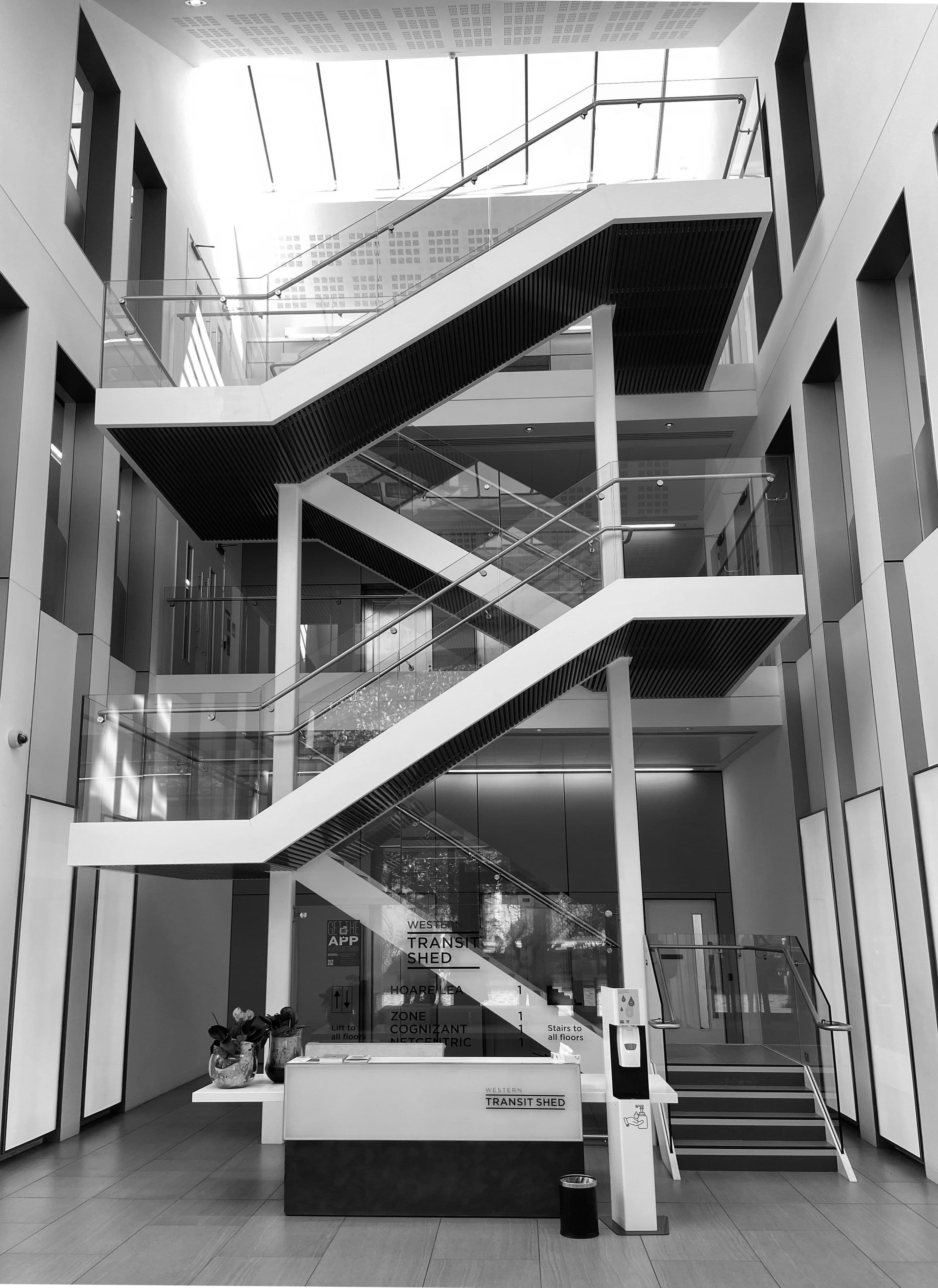
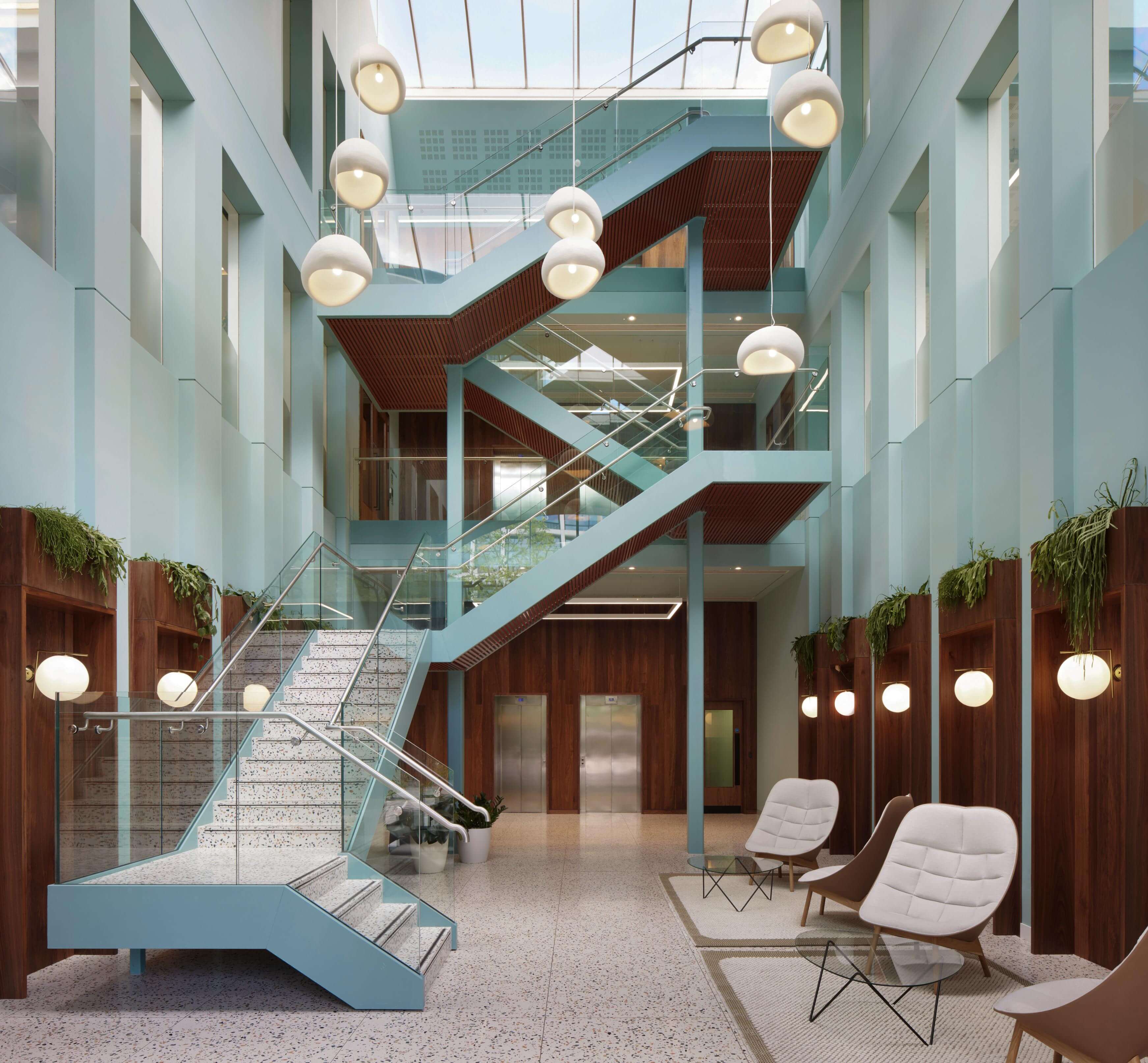
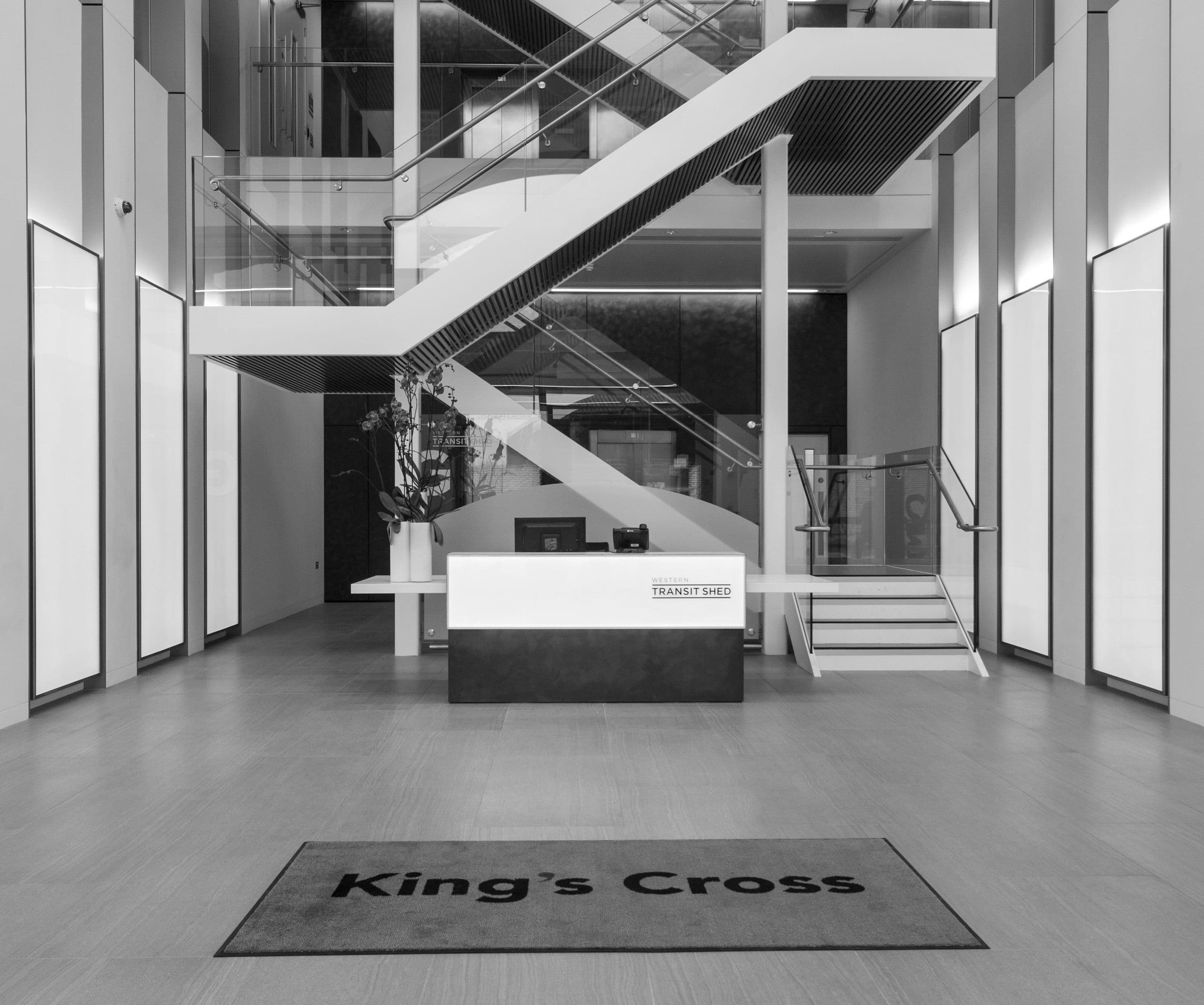
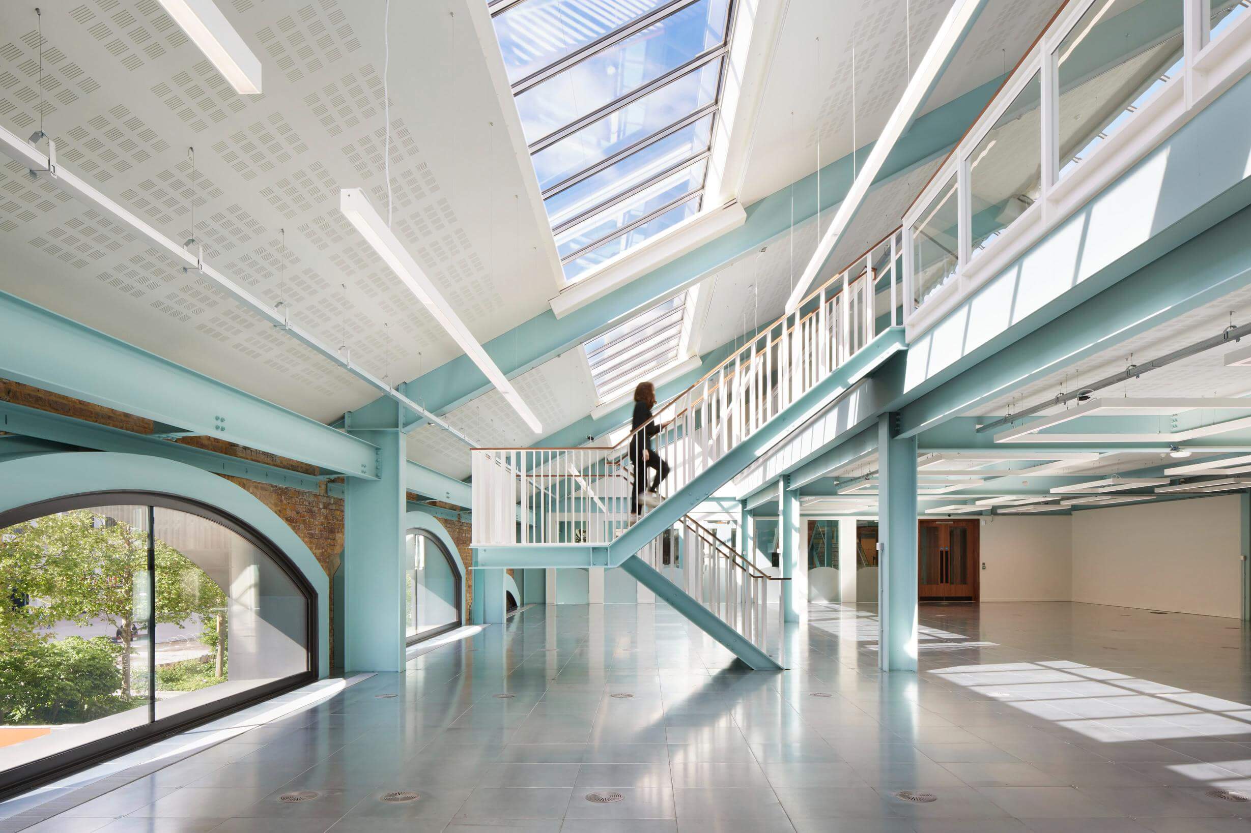
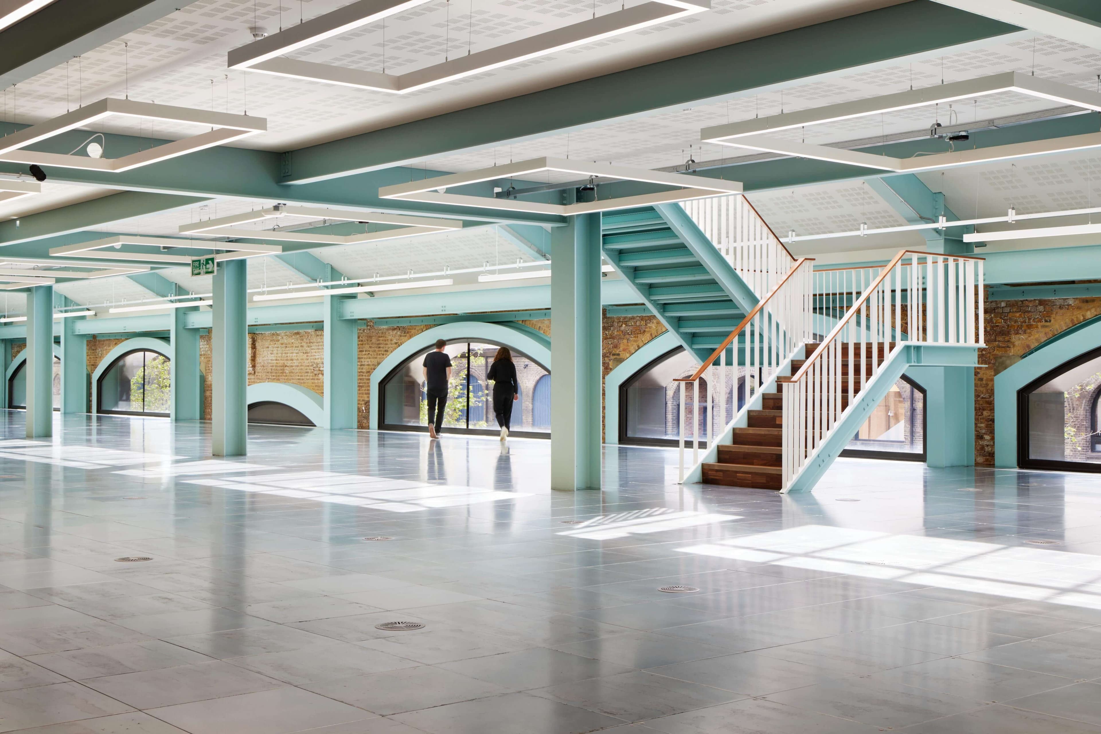
Our strategy focused on the reception and circulation route. The existing stair was visually striking, but it blocked views toward the lifts and compressed the sense of arrival. By rotating the lowest run by 90 degrees, the triple-height space opened up, creating clearer sightlines and a more intuitive route through the building. The intervention is minimal but transformative, allowing light, height and volume to be experienced more fully.
Flexibility shaped the next set of decisions. Removing the oversized reception desk freed space for softer furnishings, breakout seating and spots suited to short meetings or calls. Materials were carefully simplified: timber, terrazzo and gentle blue tones tie the scheme together without feeling decorative. Each move is deliberate and economical, helping the building feel warmer, more adaptable and better aligned with contemporary ways of working.